

Whether you like it or not, your website design will be the first impression most consumers get of your organization. Do you want them to view an electronic brochure that is flat, boring, and impersonal? Or should it be a personalized, friendly, and interactive experience that connects prospects with your business from the first visit?
Which experience, more significantly, do you believe will produce the most leads? After all, our aim, according to inbound marketing, is to create leads, right?

During their initial visit to your website, your prospects are making purchasing decisions. That’s because we (humans) make most buying decisions based on emotions first, then rationalize them afterward. Hire WordPress developer to emotionally captivate potential consumers and provide them with a great, personalized experience
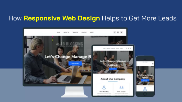
What Is Responsive Web Design and How Does It Work?
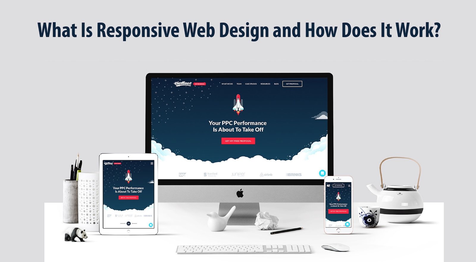
Responsive Web design is a concept that implies that design and development should adapt to the user’s behavior and surroundings, taking into an account screen size, platform, and orientation. And many WordPress design agency will help you to make your site responsive.
Flexible grids and layouts, graphics, and judicious use of CSS media queries are all part of the process. When a user moves from a laptop to an iPad, the website should adapt to the new device’s resolution, picture size, and scripting capabilities. The user’s device settings may also need to be considered; for example, if the user has a VPN for iOS on their iPad, the website should not prevent the user’s access to the page. In other words, the website should be equipped with technology that allows it to adapt to the user’s choices automatically. This would eliminate the need for each new device on the market to go through a separate design and development phase.
Why should web designers and business owners care about responsive web design?
Responsive web design frees web designers, user interface designers, and web developers from laboring 24 hours a day, 7 days a week to create websites for every possible device. It also makes life easier for entrepreneurs, marketers, and advertising.
Here are a few advantages:
- 1. One site for all devices: The website will be customized for the user’s best-viewing pleasure whether seen on a 27-inch iMac with a WiFi connection or from the screen of an Android phone.
- 2. Device-optimized design: In a responsive web design approach, all pictures, fonts, and other HTML components are resized correctly to maximize the user’s screen size.
- 3. No need for redirection: Other approaches to designing for various devices necessitate the use of redirects to lead users to the correct version of a website. The user may get to the information he wants to look at as fast as possible without having to go through any redirects.
What Makes Responsive Web Design So Important?
The modern consumer’s mobile device is used for much more than email and news reading. More and more mobile users are relying on their smartphones for a wide range of commercial activities, such as online banking and online buying, as mobile commerce adoption hits a tipping point. If your website is tough to read or doesn’t work well on a mobile device in 2016, you’re likely losing business.
The use of responsive web design is the first and most important step toward mobile SEO. If you want your website to be mobile-friendly, it should be designed on a platform that adjusts (or responds) to the various specifications of each device, changing the website’s layout as needed. WordPress agency is the best way to manage your website. We create awesome websites for awesome clients.
When you have responsive web design, no matter what device is used to access your site, all users will have a pleasant browsing experience. And after you fix the design issues that are compromising your site’s mobile user experience, you’ll begin to attract new visitors, improve revenue, and create more leads.
Still, have questions about how responsive design might help you remain ahead of the mobile marketing game? Here are a few particular responses…
1. Responsive design saves time and money.
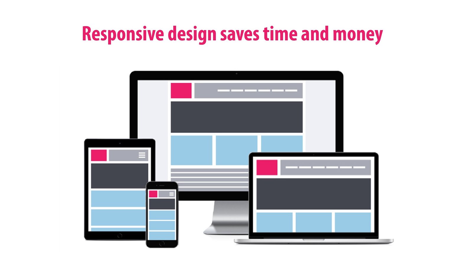
It is feasible to develop a separate mobile version of your website, but it is both expensive and time-consuming. Before a mobile site goes live, it must pass all of the same web development, maintenance, and support tests as the original site, which means double the hassle, labor, and/or cost, depending on how you look at it. Developers who use responsive design, on the other hand, simply have to test and coordinate the layout and content of a single website.
2. Use Responsive Design to Stay Afloat in Search Results
Responsive site design is quite beneficial in terms of SEO. Because mobile internet usage has become such a large part of overall internet usage, Google now gives mobile-friendly websites a boost in mobile search ranks. If your site isn’t mobile-friendly, you may expect to see a drop in search rankings (if it hasn’t already).
The clean and straightforward page structure that is unique to the unified code base of responsive web design is preferred by Googlebot and other search engine bots. You’re open-source clustering up the search engines with duplicate material when you have distinct mobile and desktop versions of your site, and those bots don’t appreciate content duplication.
3. Reduce the time it takes for a page to load
With the use of mobile devices on the rise, responsive web design makes it easier and faster for visitors to access and utilize your website. Google’s PageSpeed Developers have even established standards that essentially make responsive web design a requirement rather than a choice.
They state that the material on your site’s upper fold should load in less than 1 second, and the whole page should load in less than 2 seconds. Unlike slow-loading desktop websites, responsive sites load rapidly, allowing users to access your information immediately. As a result, your visitors’ user experience improves, and Google loves your site even more.
4. Use Responsive Design to Reduce Bounce Rates

It’s vital to have interesting information on your website, but what good is it if it can’t be seen comfortably on a mobile device’s screen? Have you ever landed on a website that wasn’t mobile-friendly and struggled to read the information and figure out how to use it? Did you spend a long time attempting to figure out what was going on with the site?
People don’t stick around when their user experience is harmed by cumbersome, mobile-unfriendly design—they bounce and go elsewhere. According to Google, if your website isn’t mobile-friendly, more than 60% of mobile consumers will switch to a competitor’s site. As a result, responsive site design reduces bounce rates by keeping users interested.
5. Use Responsive Design to Increase Conversions
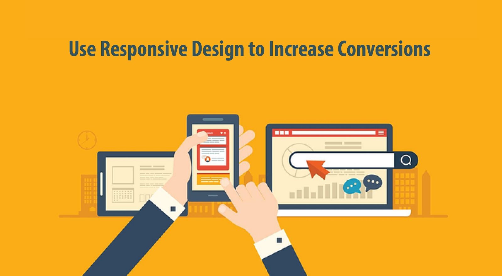
Visitors are less likely to abandon your site when it is designed responsively, and they are also more likely to spend. Conversions and responsive web design have a direct relationship. According to Aberdeen Group research, websites with responsive design saw an 11 percent year-over-year rise in visitor-to-buyer conversion rates. The increase was less than 3% for non-responsive sites.
Why is it that consumers are spending more time on adaptable websites? It’s truly that simple. The better user experience and functionality of responsive sites make it easier for customers to make purchasing decisions and place orders on your site, resulting in higher conversion rates and income
6. Use AMP to provide users with the speed they require.

The Accelerated Mobile Pages (AMP) Project, a new HTML subset that speeds up the mobile web, was recently published by Google. AMP is an open source project aimed at bringing us closer to a digital society in which publishers generate mobile-optimized content that runs rapidly on any device or platform.
The major goals of AMP are to make it easier to distribute information and to improve the user experience for individuals who access it on mobile devices. AMP improves responsive design by speeding up mobile reading experiences in their present form. And if you want to use AMP, you’ll need to make sure your site is mobile-friendly.
7. Use Responsive Design to Get a Clear Picture

Because pictures are optimized for each layout when you build a flexible style for your website, visitors will be able to enjoy and engage with the engaging visual components of your website. This solves bandwidth and scalability difficulties (scaling creates problems with color depth and resolution).
JPEG, GIF, and PNG-8 are the best file formats to utilize, but you should avoid PNG because it can bloat your picture files by up to 10 times. Scaling difficulties may be avoided by using precise picture measurements and dimensions. This also helps to retain the quality of your photos.
8. Use Crisp Responsive Typography to Entice Users
Your information will be more accessible, enjoyable, and digestible with a clean, clear typeface.
Readability is guaranteed across all devices using responsive typography, and the best bet is to leave the HTML font size at 100% because the most browser or device manufacturers select a pretty legible default for their product or platform.
The default on most desktop browsers is 16px, however other devices have substantially higher settings. Setting minimum font sizes for particular content components, such as headers and article bylines, is another option. You should also consider a good reading line length, which should be between 45 and 65 characters for comfortable reading.